oh mr caterpillar why do you hate me so...
I came up with a few new sketches, so i could make a model that was round,
i decided to keep the head as that was the only part that wasnt crap.
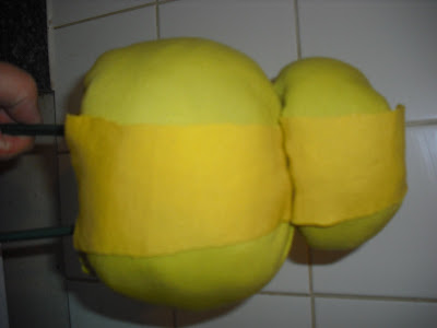
i made two oval styrofoam balls and experimented with covereing them with different materials so i could anylis them in terms of visual language and appropriteness.
I covered him with the usual model magic.
visual language and appropriatness
this new design i had developed communicated the idea visually of a fat frog. and was no more appropriate than th egreen brick from previos experiments.
i ony wish that i hadnt painted all the detail on him it took several hours.
i decided to experiment with another method, using materail.
visual communication and appropriatness
this example did communicate roundness, but it also comunicated visually that it was a babys cot toy. i really didnt think THAT would be appreciated by my target audience. not appropriate, wont be using.
what to do? i need to sit and think about the caterpillar and relook at the concept to do what i originally wanted.


No comments:
Post a Comment